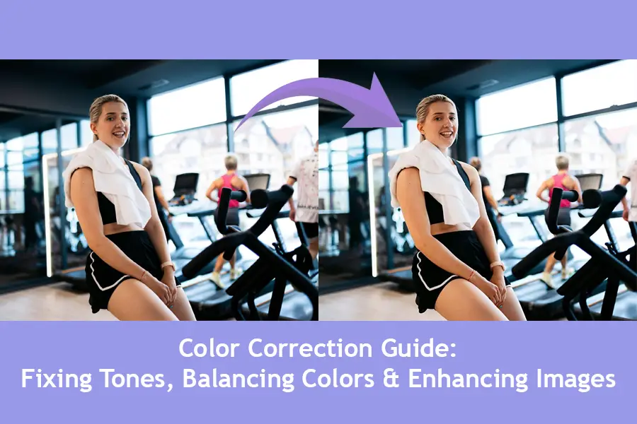
Color correction is the art of making photos appear true to life and visually appealing to others. This ensures tones are accurate,
balanced, & consistent across different platforms & media.
Whether you’re fixing tones in photos from travel, events, or ecommerce, accuracy matters. Poorly balanced images can look dull, unprofessional, or misleading to the viewer’s eye. Good correction restores the colors you saw when capturing the moment.
When applied correctly, color correction enhances clarity, creates visual harmony, and ensures consistency across different platforms and devices. In this guide, we’ll explore why accuracy matters and how to achieve professional results with reliable color correction techniques.
What is Color Correction?
Color correction is the method of making sure the colors match real-life or intended tones. It restores the truth of the scene, making photos visually trustworthy. This is a vital step before creative edits like adding filters or artistic effects. This fixes lighting issues, color casts & exposure problems for a more natural appearance.
Without it, photos can appear unrealistic, even if perfectly composed. Professionals use it to ensure consistency across multiple images from the same shoot.
Many confuse it with color grading, but they’re different processes. Correction fixes tones in photos, while grading creates a stylized or cinematic look to images. For example, wedding photos may be corrected, while films are heavily graded. Color correction aims for accuracy, & Color grading focuses on creative mood or tone.
The first step of color correction is often adjusting white balance in photos, as white balance controls image warmth & removes unwanted color casts. If this is wrong, no other adjustment will look truly correct. Another key step is correcting skin tones in portraits. Skin should look healthy and natural. Not too red or overly pale. This is used in fashion & editorial photography. For product photography, accurate color is critical for online viewers and shoppers. Brands heavily rely on professional color correction techniques to avoid customer complaints.
Adobe Photoshop & Lightroom color correction both offer precise color tools. Lightroom is quite good for bulk editing, while Photoshop excels at detailed adjustments.
Accurate correction is critical for product photography, branding, & professional portrait work. It builds trust with viewers by making images look real, consistent & high-quality.
Why is Color Correction Important?
Color correction is essential as it shapes how people feel about your images. You have a perfectly composed photo, but the tones are wrong, it eventually ruins the photo, making it unprofessional. Correct colors help to improve the mood, storytelling & overall visual impact for your audience.
In e-commerce photography, accuracy builds trust. When balancing colors in photos for online stores & websites, the goal relies on realism.
If the buyer got the product that doesn’t look like anything in the photos, then the perpetual trust is broken & the brand just lost a customer.
In fashion photography, fixing tones in photos maintains the designer’s vision. Colors must represent the fabric & design exactly as intended. The accuracy is vital for branding & creative validity.
For event photographers, maintaining white balance in photos preserves atmosphere & memory. Like, warm wedding lighting should remain inviting, not washed out or overly yellow. Color correction always ensures emotions captured in moments must be conveyed authentically.
For portrait photographers, correcting skin tones is critical for flattering, natural results. Lifelike skin helps the subject feel confident & respected.
For the company’s visuals, professional color correction methods also help maintain brand consistency. These visuals help unite across online websites, print & social media. This increases recognition & strengthens marketing efforts. Well-corrected images can increase sales by making items look appealing & accurate.
Ultimately, color correction is about trust, quality & professionalism. Whether for a client or personal project, it ensures your work
reflects true skill.
Understanding Color Problems in Images:
Color problems in images are a common drawback in photography, design & digital media. Whether you are using a DSLR camera, a smartphone, or editing software, inaccurate colors can make a picture look unnatural, dull, or misleading. Understanding the science behind colors, their digital representation & how they can be distorted is key to solving these issues.
What Are Color Problems?
Color problems refer to any visual inaccuracy where the colors in an image differ from the real-life scene. This can mean that skin tones appear unnatural, white objects look yellow or blue, or certain shades become oversaturated or faded. These issues often happen due to incorrect white balance, poor lighting, sensor limitations, or file compression.
For example, under warm indoor lighting, a camera might capture a white shirt with a yellow tint if white balance is not set correctly.
Causes of Color Inaccuracy?
The main causes of color problems can be divided into capture issues, processing issues & display issues:
- Capture Issues: Lighting type (natural daylight vs. artificial),
camera sensor sensitivity, & lens coating can all affect color accuracy. - Processing Issues: Editing software may apply unwanted automatic
adjustments, such as increased saturation or incorrect color profiles. - Display Issues: Monitors, screens & printers all have different color ranges,
meaning the same image may look different on each device.
Digital images store color using color models like RGB (Red, Green, Blue) / CMYK (Cyan, Magenta, Yellow, Key-Black). Each pixel in an RGB image has a combination of values that determine its color. The accuracy of these values depends on bit depth, which controls how many shades each color channel can represent. Lower bit depths lead to banding and poor color transitions, while higher bit depths provide smoother & more accurate results.
Common Types of Color Problems:
Color Cast: A dominant hue over the entire image, often caused by incorrect white balance.
Over-Saturation: Colors appear unnaturally intense, losing detail.
Under-Saturation: Colors look faded or washed out.
Clipping: Highlights or shadows lose color detail as the values are pushed beyond the displayable range.
Mismatched Color Profiles: Occurs when an image saved in one profile (like Adobe RGB) is displayed in another
(like sRGB), leading to dull or distorted colors.
Measures Should Take for Fixing Color Problems:
Proper White Balance: Adjust your camera’s white balance to match the lighting conditions or use a grey card for accuracy.
Calibrate Your Monitor: Use hardware calibration tools to ensure your display shows colors correctly.
Shoot in RAW Format: RAW files retain more color data, allowing for precise adjustments in post-processing.
Use Correct Color Profiles: Stick to sRGB for web use & Adobe RGB for print projects, ensuring consistency across devices.
Adjust Saturation & Hue Carefully: Subtle corrections in editing software prevent unnatural results.
Why All These Matters?
Accurate colors are essential for brand identity, product photography, portraits, & art reproduction. Inaccurate colors can mislead viewers, reduce professionalism, & cause dissatisfaction in clients. Understanding & controlling color ensures your images are both technically
correct & visually appealing.
By mastering the science & correction of color problems, photographers & designers can ensure their images remain true to life & consistent across various platforms.
Tools for Color Correction:
Color correction is one of the most essential processes in photography, videography & graphic design. It ensures that the colors in your images or videos look natural, balanced & refined.
Whether you’re adjusting a product photo for e-commerce or enhancing a portrait, the right tools can make all the difference.
Below, we’ll explore professional options like Photoshop & Lightroom, as well as free tools suitable for beginners and free to use.
Photoshop Color Correction Features
Adobe Photoshop is always considered the industry standard for professional photo editing & its color correction tools are both precise & versatile.
Curves Tool: This is one of the most powerful tools for adjusting tonal range & contrast. It works by plotting points on a curve to control the highlights, midtones & shadows. By adjusting each RGB channel individually, you can fix color casts & improve color balance.
Levels Tool: This tool helps in setting the black point, white point & midtones levels. It’s perfect for correcting exposure issues while also refining color balance.
Hue/Saturation Adjustment: Allows you to shift the hue (color tone), increase or decrease saturation. Additionally, it helps you adjust the lightness. This is especially useful for targeting specific colors without affecting the entire image.
Selective Color: This unique feature lets you modify specific color ranges (like reds, blues, or yellows) without impacting other colors. It’s often used in product photography to ensure accurate branding colors.
Lightroom Color Correction Panels
With Adobe Lightroom, users can edit multiple images simultaneously & perform non-destructive color adjustments,
making it a favorite among photographers who work with large image libraries.
HSL/Color Mixer: HSL stands for Hue, Saturation & Luminance. This panel allows you to fine-tune each color individually.
For example, you can make the sky bluer without altering the rest of the image.
White Balance Adjustment: White balance ensures that colors appear as they would under natural lighting conditions. Lightroom offers presets (Daylight, Cloudy, Tungsten) & manual adjustments for precise results.
Tone Curve: Similar to Photoshop’s Curves, but more streamlined for photographers. It’s great for adding contrast & controlling color tones.
Color Grading Panel: Allows adjustment of shadows, midtones & highlights separately for creative looks or film-like tones.
Hardware Calibration Tools
Even the best software can’t deliver perfect color correction if your monitor is not displaying colors accurately. This is where colorimeters come in.
Devices like the X-Rite i1Display Pro or Datacolor SpyderX measure your screen’s output & create a custom color profile. This ensures that what you see on your monitor matches the final print or digital output. Calibration is essential for professionals working in photography, printing & design where color accuracy is non-negotiable.
Color correction is both a technical & creative process. Photoshop & Lightroom remain the go-to tools for professionals due to their precision & flexibility.
However, GIMP, Canva Pro & darktable provide cost-effective options for beginners & small businesses. The key is understanding how each tool affects your image’s color balance, saturation & tonal range so you can choose the right workflow for your needs. By mastering these tools, you can ensure your visuals are both accurate & design-forward.
Step-by-Step Color Correction in Photoshop:
Color correction is one of the most essential skills in digital image editing. Whether you’re working on portraits, landscapes, product photos, or creative composites, accurate colors can make your images look more professional. Color correction in Photoshop ensures your image’s tones match real-life scenes & mood.
Step 1: Open & Duplicate Your Image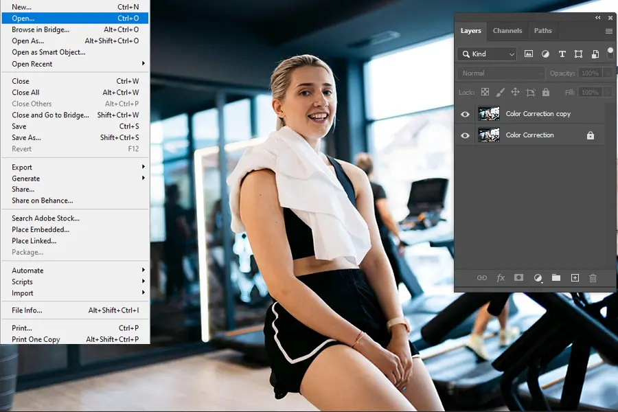
Before making any changes, open your images in Photoshop. The safest approach is to duplicate your background layer (Ctrl+J on Windows & Command + J on Mac). This way, the original files remain untouched & you can compare the original with the edited version.
Duplicating the Image: Digital editing is a non-destructive process when you work on copies. This prevents permanent changes & gives you the flexibility to adjust anytime. Editors think of this as a backup, a small step that can save a lot of trouble.
Step 2: Analyze the Color Issues
Before going into adjustments, you need to look for the main problem; look for:
1. Color Casts.
2. Incorrect Skin Tones.
3. Over or Under – Saturated Colors.
4. Shadows Lacking Detail.
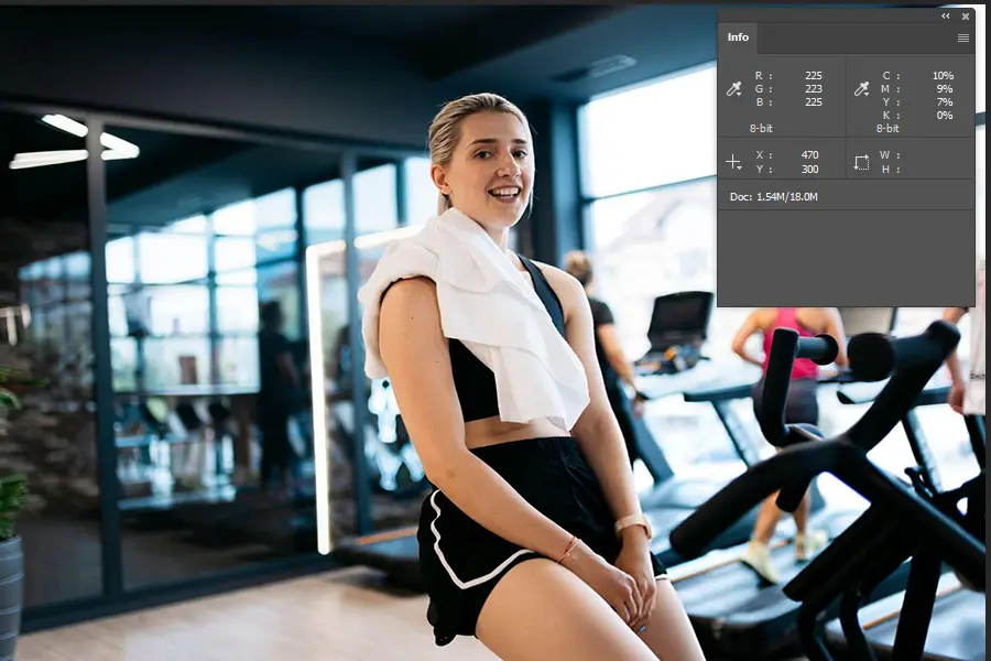
You can look into Photoshop’s Info Panel to read RGB values for specific areas, or simply use your eyes to detect unnatural tones.
Examples: if a white shirt looks slightly yellow, then it means there is a warm color cast.
This analysis will guide the tools & techniques you’re going to use in the next steps.
Step 3: Adjust White Balance
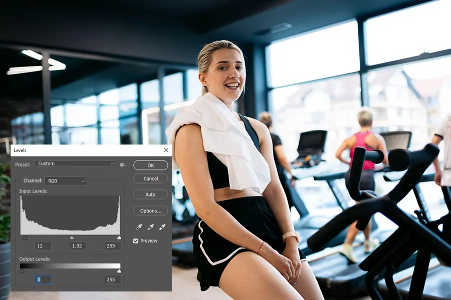
White balance controls how warm or cool an image looks. In color correction in Photoshop, this is one of the most important starting points.
Go to Image > Adjustment > Levels or use the Camera Raw Filter. With the camera raw filter, select the White Balance Tool (eyedropper) & click on something in the image that should be pure white or neutral gray. Photoshop will adjust the temperature & tint to make that area neutral.
Scientific Takeaway: Our eyes naturally adapt to different lighting conditions, but cameras often fail to do so perfectly. Correcting white balance makes the colors match what we see in real life.
Step 4: Use Curves for Tonal Balance
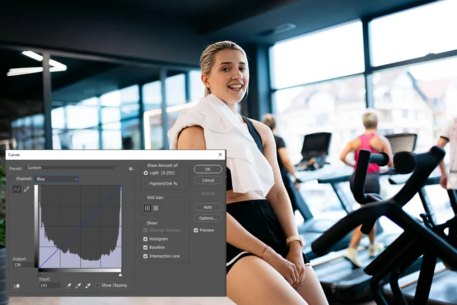
The Curves Adjustment Layer is one of Photoshop’s most powerful tools for fine-tuning color & exposure. It lets you adjust highlights, midtones & shadows independently for each color channel (Red, Green, Blue).
Process:
1. Open the Curves Adjustments layer (Layer > New Adjustment Layer > Curves).
2. Select the RGB channel to adjust overall brightness & Contrast.
3. Switch to Red, Green, Blue channels to remove specific color casts in shadows, midtones & highlights.
Example: If shadows look too blue, switch to the Blue channel & slightly lower the curve for the dark areas.
Step 5: Fine-Tune Saturation & Vibrance
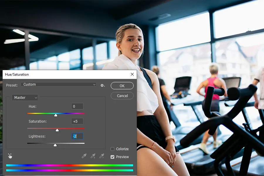
Once the tonal balance is right, focus on color intensity. Go to Image > Adjustments > Hue/Saturation or add a Hue/Saturation Adjustment Layer.
1. Saturation: This increases or decreases the intensity of all colors equally.
2. Vibrance: This adjusts intensity more subtly, protecting skin tones from looking unnatural.
A good practice is to increase vibrance slightly (+10 to +15) & adjust saturation only if necessary. Too much saturation can make images look artificial, especially in portraits.
Related Tip: If your image has multiple objects, you can adjust individual color ranges (Reds, Blues, Greens, etc) for more targeted results.
Step 6: Correct Skin Tones (Selective Color)
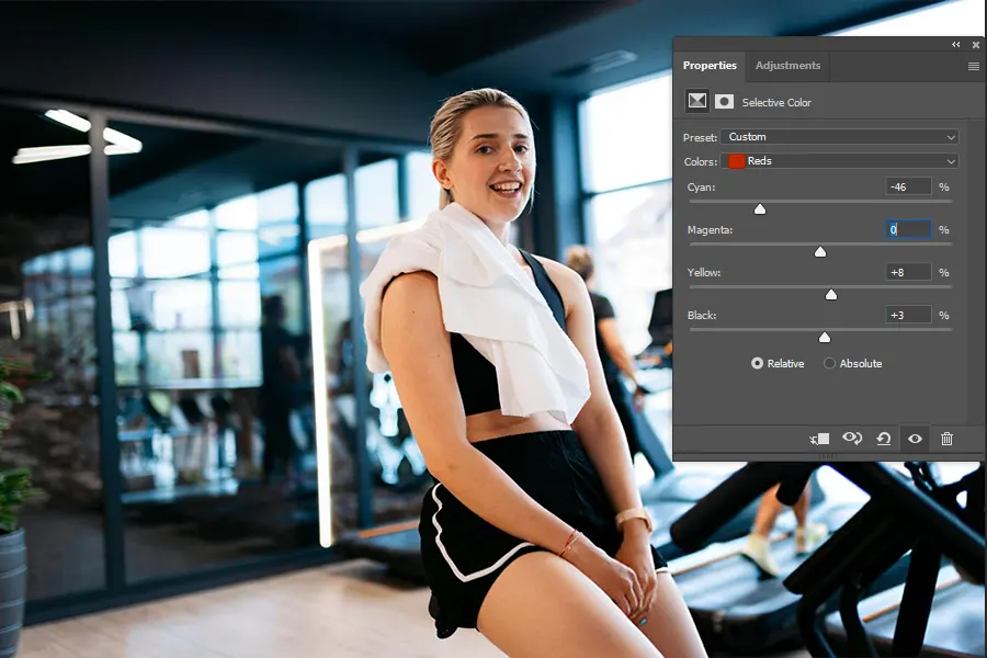
Skin tones are particularly sensitive in color correction in Photoshop because even small shifts can make them look unnatural.
The Selective Color Adjustment layer is a great tool. You’ll find the bit-by-bit steps here:
1. Go to Layer > New Adjustment Layer > Selective Color.
2. Choose “Reds” from the color drop-down.
3. Adjust Cyan, Magenta, Yellow & Black sliders to refine skin tones.
Example: If the skin looks too red, reduce magenta slightly & increase yellow to add warmth.
Scientific Takeaway: Natural skin has a balance of red & yellow with very little blue. Correcting it ensures the subject looks healthy & realistic.
Step 7: Apply Local Adjustments if Needed
Not every part of the image needs the same correction. For instance, a shadowed area may need more warmth while the rest of the image is fine.
Use Layer Masks to apply adjustments only to certain areas. This way, your edits are targeted & won’t affect the entire image unnecessarily.
Example:
1. Apply a Curves adjustment to brighten a dark corner, then paint black on the mask to hide it from other areas.
2. Use Hue/Saturation on just the background without changing the subject.
This step gives you the most control, allowing you to polish details without compromising overall balance.
Step 8: Compare Before & After
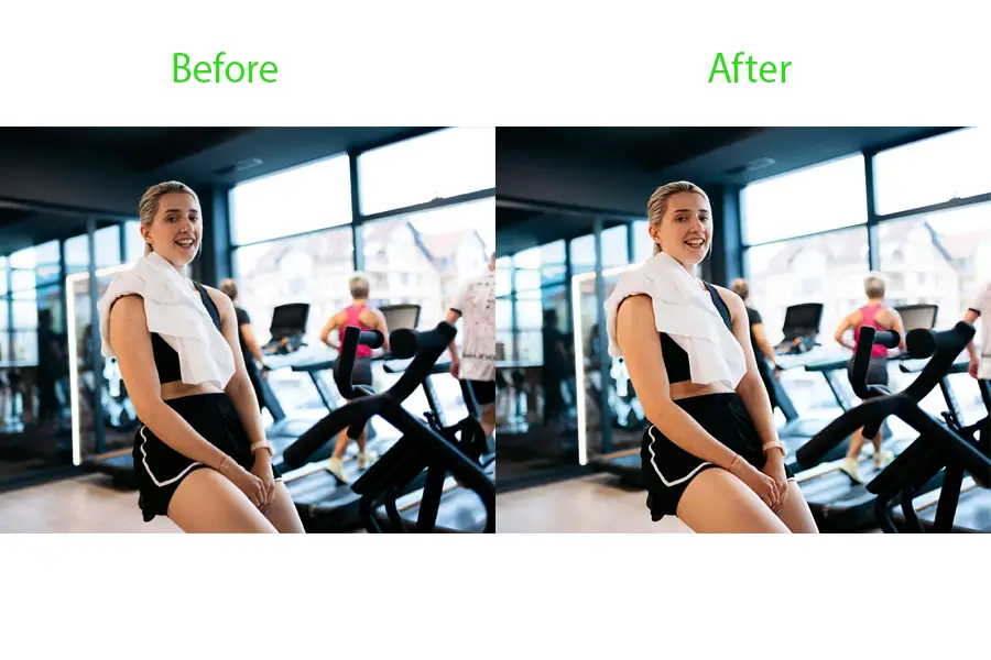
The early stage of the final step is quality control. Switch the in-built visibility of your
adjustment layers to compare the before & after versions.
When comparing before & after, look for this:
1. Are the colors natural & balanced.
2. Is there any unwanted color cast left.
3. Do the tones match the mood of the photo.
Step 9: Save File for Web/Print
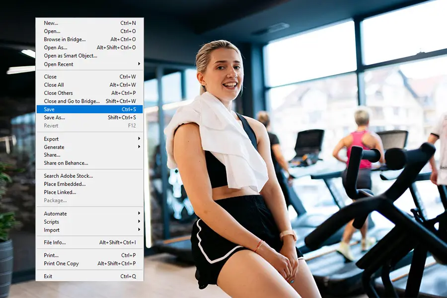
When everything is aligned with your vision & satisfied, then save your file.
1. For Web: File > Export > Save for Web (JPEG or sRGB Profile).
2. For Print: Save as TIFF or high-quality JPEG with the correct color profile (Adobe RGB or CMYK, depending on your printer).
Mastering color correction in Photoshop takes practice, but once you understand the logic behind each adjustment, it becomes second nature. By following these nine steps, from analyzing color issues to saving your final work, you’ll have a clear, concise & methodical process that works for everything from casual shoots to professional projects.
Step-by-Step Color Correction Process in Lightroom
Color correction in Lightroom is an important skill for photographers, whether working on portraits, landscapes, or product photography.
If it’s done correctly, this can completely transform any flat, dull image into one that’s visually striking & true to life.
Step 1: Import & Select Your Image
At first, launch Lightroom & click Import in the Library Module to bring your desired photo into Lightroom. Then, choose “Add” or “Copy” depending on whether you want to keep the original file or create a new copy.
When importing, use shooting in RAW format instead of JPEG, as RAW files contain far more color & exposure data. This gives you greater flexibility during editing times. This extra data ensures that your color correction will be more accurate & less prone to artifacts.
Once imported, select the image you want to work on. It’s good practice to pick the sharpest, best-composed shot from your series.
This will make all your adjustments worthwhile.
Step 2: Adjust White Balance
White balance sets the foundation for accurate color correction in Lightroom. It determines how warm or cool your image appears. An incorrect white balance can make whites look blue or yellow. This makes the skin tones appear unnatural.
In the Basic Panel, use the Temp Slider to adjust between warm (yellow) & cool (blue) tones. The Tint Slider corrects green or magenta shifts. A fast method is to use the White Balance Selector (eyedropper) & click on a neutral gray in the image. Lightroom will automatically adjust the temperature & tint to make that spot perfectly neutral.
If no neutral gray is available, use your judgment & tweak until the colors feel natural. Remember this: accurate white balance helps every later adjustment look more realistic.
Step 3: Tweak Exposure & Contrast
With white balance set, adjust the Exposure Slider to ensure your image is neither too dark nor too bright. A balanced exposure reveals the full range of tones without losing details in shadows or highlights.
Increase Contrast slightly to make the image pop. However, overdoing contrast can crush shadow detail & blow out highlights.
Instead of this, use the Highlights & Shadows sliders to fine-tune light balance. This helps recover details in bright skies or dark clothing. Exposure adjustments affect how colors are perceived, so keeping them balanced ensures the later HSL & tone curve edits are accurate.
Step 4: Fine-Tune Colors with HSL/Color Mixer
The HSL/Color Panel (Hue, Saturation, Luminance) allows you to target specific colors without affecting the rest of the image. This is where precise color grading begins.
1. Hue changes the actual color. Take an example: shifting a blue sky toward teal or purple.
2. Saturation controls how intense a color appears.
3. Luminance adjusts brightness for that specific color.
For Landscapes, you might make greens more vibrant & blues slightly deeper.
For Portraits, be cautious with skin tones. Try to avoid oversaturating reds & oranges.
The main key here is balance. Over-saturated colors can look fake, while under-saturation can make an image lifeless.
Always cross-check with your white balance from Step 2 to ensure harmony.
Step 5: Use Tone Curve for Highlights/Shadows
The Tone Curve offers more precise control over brightness levels than the basic sliders.
It’s like a fine-tuning instrument for contrast & tonal balance.
on the Point Curve, click & drag points to adjust different regions:
1. Bottom left controls shadows.
2. Midsection adjust midtones.
3. Top right brightens highlights.
For a natural look, use a gentle S-Curve to slightly lift highlights & deepen shadows. This method increases contrast without losing detail. Tone curve adjustments influence perceived color richness. A slight shadow lift can make muted colors appear softer, while boosting highlights can add vibrancy.
Step 6: Adjust Skin Tones for Realism
In portrait photography, accurate skin tones are crucial. Over-editing can make skin look orange or pink, while under-editing can leave it dull.
Return to the HSL Panel, focusing on reds, oranges & yellows. Slightly shift the Hue to correct unnatural undertones, adjust Saturation to prevent over-coloration & tweak Luminance for a healthy glow.
For subtle blemish removal or uneven tone correction, use the Adjustment Brush & slightly desaturate or lighten the targeted area.
Always zoom in to ensure your changes look natural at full resolution.
Step 7: Use Graduated Filters for Selective Adjustments
Graduated filters (Linear Gradients in newer Lightroom versions) let you enhance specific areas without affecting the whole image.
For Example:
1. Darken an overexposed sky while keeping the foreground untouched.
2. Warm up the lower half of a landscape while leaving the top cool for contrast.
you can also apply color grading effects selectively. When adding a warmer tone to the foreground for depth, try to combine it with exposure, contrast & saturation adjustments to guide the viewer’s eye.
Step 8: Compare Before & After
Before exporting, press the Backlash () key to toggle between your edited & original image. This helps ensure you haven’t gone too far & that your color correction in Lightroom looks natural.
Step 9: Export Correctly
When exporting, choose the correct settings:
1. File format: JPEG for Web & TIFF for Printing.
2. Color Space: sRGB for Online use & Adobe RGB for Print.
3. Maintain a resolution of at least 300 ppi for Print quality.
This final step ensures all your hard work translates well, whether you’re posting online or delivering to a client.
Editing a photo with Lightroom is both an art and a science. Balanced exposure, a strategic color palette, and selective adjustments create an image that is visually appealing and technically accurate. Practice regularly, and soon, this workflow will become second nature.
Pro Tips for Image Color Correction
Editing an image is more than just adjusting brightness or adding filters. The real goal is to bring accuracy, balance & natural
beauty to a photo. Below are some pro tips for fixing tones, balancing colors & enhancing images effectively.
Use Reference Images for Color Accuracy
One of the best ways to achieve realistic color correction is by comparing your photo to a reference image. This could be another professionally edited photo or even a real-life scene captured under proper lighting. A reference provides a guide to ensure your adjustments don’t drift too far from reality.
For instance, if your subject’s skin looks too orange, comparing it to the reference helps you quickly identify the problem. This technique is especially useful in product photography, where color accuracy is crucial for online sales.
Calibrate Your Monitor
Even the most accurate editing can look wrong if your monitor is not displaying colors correctly. A non-calibrated screen may show cooler (bluish) or warmer (yellowish) tones than they really are. Calibrating your monitor with tools like a colorimeter ensures that what you see is what others will see too on different devices & in print.
This step is vital for anyone who takes color correction in Photoshop or Lightroom seriously, as it removes guesswork & makes results consistent.
Work in RAW Format
Whenever possible, shoot & edit in RAW instead of JPEG. RAW files contain far more data, giving you flexibility in recovering shadows, reducing highlights & adjusting white balance without losing quality.
For example, if a photo is underexposed, the RAW format allows you to brighten it while maintaining details, something JPEG cannot do as effectively. This is especially important in professional workflows where precision in tones & colors is required.
Avoid Over-Saturation
While it might be tempting to make colors “pop”, too much saturation can make images look unrealistic. Over-saturated skies may turn unnaturally blue, while skin tones may appear artificial.
Instead, aim for balanced vibrance, which enhances colors selectively without making them harsh. A good rule is to step back from the screen after making adjustments. If colors seem exaggerated, reduce the effect for a more natural finish.
Keep Skin Tones Natural
Skin tones are one of the most noticeable elements in photos. Even slight changes can make a portrait look unnatural. When editing, focus on achieving warm, natural tones that reflect the subject’s actual appearance.
Tools like the HSL sliders in Lightroom or Selective Color in Photoshop allow you to fine-tune reds, oranges & yellows, which primarily affect skin. Always compare your results with a neutral reference to avoid overly red or pale skin.
Use Adjustments Layers for Non-Destructive Editing
In Photoshop, adjustment layers give you the flexibility to edit without permanently altering your image. For example, if you apply a Curves or Hue/Saturation adjustment as a layer, you can always go back & modify or remove it later. This ensures maximum control & prevents accidental loss of image quality.
Non-destructive editing is the professional standard, allowing you to experiment confidently while keeping the original file intact.
By applying these tips, you can improve images as a professional would. Remember, great editing is not about an image looking “edited” but making it look natural, polished & visually appealing. With consistent practice, this method becomes second nature, making your workflow faster & reliable.
The Impacts of Color Correction in E-commerce & Branding
In the fast-paced world of e-commerce & digital branding, the first impressions are everything. Potential buyers & customers decide
within seconds. In this part, visual elements play an important role in progress. That’s where color correction becomes essential.
Boosting Product Sales with Accurate Colors
When buyers & shoppers browse online stores, they cannot physically touch or test the products or test the products.
Instead, their judgment relies on what they see.
Take, for example, a red dress that looks orange. This can cause loss of trust from the customer. Proper color correction for e-commerce guarantees that the shades of clothing, accessories, or even furniture match real-life expectations. This accuracy increases sales exponentially.
Preventing Color Mismatch Complaints
One of the most common issues in online shopping is receiving a product that doesn’t match the photo. This mismatch often leads to returns, refunds & negative reviews.
By applying professional color correction methods, brands can prevent these disappointments. Correcting white balance, adjusting tones, and refining saturation help products appear as they would under natural light. This way, the chances of customer complaints significantly decrease.
Ensuring Visual Consistency in Branding
Color correction is not limited to product photos. It extends to all forms of marketing & branding. A brand’s visual identity depends on maintaining consistency across social media, advertisements, websites & packaging. For example, if a brand uses a signature shade of blue, it must appear identical across every platform.
Accurate color correction in e-commerce is more than an editing step; it is a business strategy. It ensures product authenticity, reduces returns & strengthens brand identity, making it a vital tool for success in today’s online competitive market.
Color Correction vs. Color Grading: Key Differences
Color Correction & Color Grading are 2 very different systems, but often confused in visual media. Both are essential in photography & videography & digital branding. Knowing when to use one or both can make a huge difference in how your images or videos are perceived.
Color grading is the process of applying creative tones, styles, or moods to an image or video. Instead of simply fixing issues, grading is about enhancing the emotional impact of visuals. For example, a movie scene may use warm orange tones to create a nostalgic feeling or cool blue shades to evoke suspense. In photography, grading can give portraits a cinematic feel or make landscapes look more dramatic. Keywords like cinematic tones, mood creation & artistic intent are strongly tied to color grading.
Understanding Color Correction vs. Color Grading
The main difference is that color correction focuses on accuracy, while color grading focuses on creativity.
Color Correction: Adjusting exposure, whit balance, contrast & saturation to achieve natural & true-to-life colors.
It ensures skin tones look realistic, products appear as they do in real life & there are no unwanted color casts.
Color Grading: Styling the corrected image with creative color palettes. This could mean making shadows cooler,
highlights warmer, or applying a teal & orange cinematic look.
Both processes are often linked. Correction is the first step & then comes the process of Grading.
Practical Examples
In ecommerce photography, only color correction is required. Customers expect accurate product colors so they can confidently purchase without worrying about mismatches. Over-stylized grading here could mislead buyers & harm a brand’s credibility.
In contrast, cinematic film stills rely heavily on grading. Directors & editors intentionally apply unique tones to build atmosphere & guide audience emotions.
Tools Used
Color Correction Tools: Photoshop (Curves, Levels, White Balance), Lightroom (HSL, Color Mixer) & free tools like GIMP.
Color Grading Tools: DaVinci Resolve, Adobe Premiere Pro, Final Cut Pro & advanced LUTs (Look-Up Tables) designed to achieve
specific film looks.
When to Use One or Both
Use color correction only when working with product photography, portraits, or any image requiring accuracy & consistency.
Use color grading when the goal is to create mood, drama, or style, such as in films, advertising campaigns, or artistic photography.
Use both when you need a professional pipeline, correct first to fix technical flaws, then grade to add creative flair.
In short, correction ensures accuracy, while grading shapes emotion. Both together can turn ordinary visuals into powerful storytelling tools.
FAQs.
1. How to Fix Skin Tones in Photos?
To fix skin tones, use white balance correction & HSL (Hue, Saturation, Luminance) adjustments. The goal is to avoid unnatural redness, yellowness & dullness. Reference charts or a gray card help achieve accurate tones while keeping skin natural.
2. Can I Do Color Correction Without Photoshop or Lightroom?
Yes, free tools like GIMP, Snapseed & Canva offer basic color correction. For advanced needs, online editors & mobile
apps provide sliders for exposure, white balance & contrast adjustments.
3. How Do I Keep Colors Consistent Across Different Devices?
Always calibrate your monitor & work in sRGB or Adobe RGB color space. Export images in standard formats to minimize
color shifts on phones, laptops & print.
4. What Are the Most Common Mistakes in Color Correction?
Common mistakes include over-saturation, ignoring skin tones, skipping monitor calibration & using destructive editing
instead of adjustment layers.
Conclusion
Color correction is more than just an editing step; it’s the foundation of creating professional-looking photos. By fixing tones, balancing colors & enhancing details, images not only appear visually appealing but also communicate trust & accuracy to the viewer. Whether it’s correcting skin tones in portraits, ensuring products look true to life in e-commerce, or maintaining a cohesive brand identity. Proper color correction makes a noticeable difference.
This guide has been designed to support both beginners & experts, covering essential techniques & advanced insights. From simple adjustments using free tools to more advanced corrections with professional software, every method explained here provides a pathway to achieving better and more reliable results.
Now it’s your turn to apply these methods & system to your own images & notice the transformation. With consistency, patience
& the right workflow, your photos can stand out with clarity, accuracy & professionalism.

Hadi Zaman is a marketing specialist and content writer who loves tech, story writing, and content creation. With years of experience, he creates easy-to-read content that connects with readers. Inspired by new ideas and personal experiences, Hadi makes complex topics clear and relatable.